Major Changes to Samsung Health in 2026
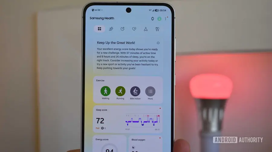
Samsung Health, the health app that has become a staple for Galaxy device users, has just launched a striking and colorful new design ahead of the Galaxy Watch 9 introduction and the One UI 9 release. Although these changes bring a fresh vibe, the user experience is not entirely positive. Here are some interesting points and drawbacks I encountered after using the app.
Colorful Design That’s Attractive but Confusing
I am a fan of vibrant Android looks. Nothing pleases my eyes more than high contrast and bright tones. However, the new Samsung Health design seems to have gone overboard. The excessive use of colors, from the bold ombre backgrounds to the overly bright widget cards, left me feeling confused.
In the previous version, each color represented a specific metric, such as green for activity and blue for sleep. Unfortunately, in this new version, the colors no longer correlate with the data they represent. For example, purple is used for calories and sleep score, while blue is for workouts and body composition. This inconsistency makes the information presented difficult to understand.
Shortcut Bar Simplifies Navigation
Despite some confusing changes, not all updates in Samsung Health are negative. The latest version introduces a shortcut bar at the top that allows users to easily switch between different health aspects such as Activity, Sleep, Vital, Mindfulness, and Nutrition. This is a positive step that greatly helps reduce the time spent searching for specific metrics throughout the app.
With this shortcut bar, I no longer have to wonder if I placed the body composition widget on my dashboard. I can directly go to Nutrition to find it. Similarly, the running coach can be found under Activity and heart rate under Vital. Everything feels more organized and accessible.
Visual Improvements on Graphs, But Still Limited
Graphs are a crucial element in presenting information collected by various health sensors on the smartwatch. With this new design, Samsung Health attempts to enhance graph visualization, but the results are mixed. Some graphs can now be zoomed in or out, but this only applies to a few graphs.
For example, the sleep graph shows various small lines indicating restless moments throughout the night. Unfortunately, this graph does not support zoom, preventing deeper analysis of specific times. The same applies to heart rate and blood oxygen graphs during sleep. However, heart rate and blood oxygen graphs while awake do support zoom. Why this inconsistency?
I also hoped for a comprehensive graph page that allows combining multiple metrics. This feature would be very helpful to see how data changes over time and context. Unfortunately, currently, comparisons can only be made within the same metric data.
Inconsistent Features and Confusion Among Widgets
Another major update is the addition of new health features aligned with the One UI 9 launch. However, many of these features do not support my Galaxy Watch 4. Unfortunately, the app still displays widgets for features that do not work, forcing me to manually hide those widgets. This is quite frustrating, especially for new users who might feel confused.
Not only that, some widgets I removed from the main screen keep reappearing, creating even more confusion. This could be a bug or an unwanted feature, but it is clearly very annoying.
Conclusion: Hope for Future Updates
The Samsung Health redesign is a promising step in an interesting direction. Although it looks bright and shows some improvements in usability, there are still many shortcomings that need to be addressed. I hope Samsung will continue updating this app alongside the One UI 9 and Galaxy Watch 9 launches, so both new users and those still using older devices can enjoy better enhancements.
For now, it might be better to enjoy the older version of Samsung Health before fully switching to this new design.
Source: https://www.androidauthority.com/samsung-health-app-2026-update-hands-on-3679261/