Google Translate telah mengalami evolusi yang signifikan selama beberapa tahun terakhir. Awalnya, aplikasi ini hanya berfungsi untuk menerjemahkan kata dan frasa, namun kini pengguna dapat melakukan percakapan multibahasa dan bahkan berlatih bahasa baru. Meskipun telah ada banyak fitur baru, tampilan layar utama dan desain keseluruhan aplikasi ini hampir tidak berubah dan mulai terasa ketinggalan zaman dibandingkan dengan aplikasi Google lainnya di Android. Kini, Google tampaknya akhirnya memberikan pembaruan yang sangat dibutuhkan untuk Translate.
Pembaruan Antarmuka yang Menarik
Dari penggalian kami pada versi 10.25 aplikasi Google Translate untuk Android, kami menemukan bahwa layar utama telah didesain ulang untuk memberikan antarmuka yang lebih modern dan menonjolkan fitur-fitur baru yang semakin banyak. Meskipun desain baru ini belum diluncurkan, Google tampaknya sedang aktif mengerjakan tampilan baru ini.
Menu Navigasi Baru
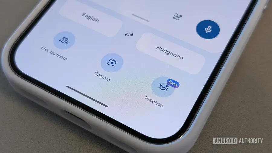
Perubahan pertama yang akan Anda lihat adalah bar navigasi baru di bagian bawah layar. Alih-alih menggunakan bar bawah penuh tradisional dengan tab seperti banyak aplikasi Google lainnya, Translate kini hadir dengan bar bawah berbentuk pil yang memiliki empat bagian. Ini memberikan tampilan yang lebih bersih dan terorganisir.
Perubahan pada Kotak Input Terjemahan
Sementara itu, kotak input terjemahan telah dipindahkan ke bagian bawah antarmuka, menggantikan area teks besar yang mendominasi tengah layar. Kotak input ini kini termasuk tindakan cepat, seperti menu tiga titik untuk opsi tambahan, pintasan Paste, dan tombol mikrofon untuk input suara. Di atas kotak input, Google juga menampilkan beberapa pintasan kontekstual.
Organisasi yang Lebih Baik dalam Aktivitas
Di sudut kiri atas, pintasan Saved yang lama telah dihapus dan digantikan oleh menu hamburger tradisional. Ini memungkinkan Google untuk mengorganisir lebih banyak opsi di masa depan tanpa mengacaukan antarmuka utama. Mengklik ikon hamburger kini membuka layar baru bernama “Aktivitas Anda”, yang mengumpulkan riwayat terjemahan Anda, terjemahan yang disimpan, dan transkrip yang disimpan dalam satu tempat. Ini seharusnya mempermudah pengguna untuk mengakses kembali terjemahan dan percakapan sebelumnya.
Secara keseluruhan, desain ulang ini menjadikan Google Translate lebih bersih dan modern. Namun, seperti banyak perubahan antarmuka yang terdeteksi sebelum rilis, tidak ada jaminan bahwa desain ini akan diluncurkan persis seperti yang ditunjukkan atau kapan Google berencana untuk membuatnya tersedia.
Sumber: https://www.androidauthority.com/google-translate-redesign-3684635/